Web Redesign Case Study for Vineyard Landscape & Maintenance

About Project

WSIMLogiX redesigned the Vineyard Landscape & Maintenance website to elevate the brand experience and strengthen online lead generation. The project included designing an SEO-friendly site architecture, UX wireframes, and a modern UI design tailored for easy navigation across devices. This case study demonstrates how a polished, conversion-focused website supports long-term growth.

Problem Statement

Vineyard Landscape & Maintenance needed a complete website redesign to better reflect the quality of its landscaping and outdoor living services and to support consistent lead generation. The older site experience did not provide a clear, mobile-first journey for visitors exploring services, evaluating trust signals, and taking action. Navigation and page structure required improvement, so users could quickly find the right service and reach contact pathways without friction. The redesign also needed an SEO-ready architecture to strengthen service visibility over time.

Client Overview

Business: Vineyard Landscape & Maintenance

Industry: Landscaping, hardscaping, outdoor living

Location: Livermore, CA

Target audience: Homeowners and property managers searching for reliable, licensed landscaping + outdoor construction services.

What they offer:

  • Landscape design & maintenance
  • Concrete patios / walkways, pavers, retaining walls
  • Artificial turf, drought-tolerant landscaping
  • Landscape lighting, pergolas and similar outdoor upgrades

Business Challenge Before Redesign

The website wasn’t doing its real job: build trust fast & convert visitors into calls and quote-requests.

Instead, the experience felt dated and unclear, so users were more likely to bounce and compare other contractors.

Problems Before Redesign

UX issues

  • Navigation wasn’t optimized for “service-first” browsing (users had to hunt for what they needed).
  • The user journey wasn’t guided (no clear “next step” from homepage → service → contact).
  • Mobile experience was not prioritized, making key actions harder for on-the-go visitors.

Conversion issues

  • CTAs weren’t consistently visible where intent is highest.
  • The first impression of the outdated web design didn’t reinforce trust quickly enough.
  • Leads weren’t being “captured” early. Visitors could browse without ever being nudged to request an estimate.

SEO / performance issues

  • Service pages and site structure needed a clearer hierarchy to support local/service keyword discovery.
  • The redesign required an SEO-friendly architecture, so each primary service could stand on its own in search over time.

Our Redesign Strategy

UX improvements – Create Structure First

We started by rebuilding the site from the inside out.

What we did

  • Created an SEO-friendly sitemap and page hierarchy.
  • Built a wireframe that maps conversion paths clearly:
    • Home → Services → Service detail → Contact / Request Estimate
  • Planned CTA placement intentionally in header, hero, and mid-page sections.

Why it matters

  • Visitors can instantly answer: “Do they offer what I need?” and “How do I get a quote?”
  • Search engines can better interpret each service page’s purpose and relevance.

UI decisions - Make it Feel Premium & Trustworthy

Once the UX wireframe was approved, our UI team designed a modern visual system that supports fast decision-making.

Key UI upgrades

  • A stronger hero section, which includes a clear message + visual impact + quote button
  • Cleaner typography and spacing for scan-friendly reading
  • Trust-forward layout (important info appears early, not buried)
  • Consistent buttons and section patterns across pages, so users learn the interface quickly

SEO improvements - Built into the Redesign

  • Pages organized around service intent (not just general marketing copy)
  • Better internal linking opportunities between related services
  • Cleaner content structure (headings and sections designed for readability and indexing)

Quality Check, Migration & Implementation

Before launch, WSIMLogiX’s QC team validated the redesigned website to ensure the UX and UI weren’t just visually strong, but also functional, fast, and consistent across devices.

What our QC team checked

  • UX flow & usability: Verified the user journey from homepage → services → contact, ensuring key actions stay obvious.
  • UI consistency: Checked spacing, typography, button styles, and section layouts for a polished, uniform look.
  • Mobile responsiveness: Tested across screen sizes to confirm tap-friendly menus, readable content, and properly stacked sections.
  • Navigation performance: Ensured menu items, internal links, and page pathways were intuitive and error-free.
  • Page speed & performance: Optimized assets and reviewed load behavior to reduce friction and drop-offs.
  • Form functionality & CTAs: Tested contact forms, click-to-call actions, and quote requests to confirm smooth lead capture.
  • Security & launch readiness: Confirmed the build met standard website safety checks before going live.

Migration & Build Setup

After QC approval, the new website was migrated and launched on a stable, scalable stack designed for long-term management.

  • Platform: WordPress
  • Builder: Elementor Pro

Why this stack

  • Smooth migration & structured deployment: WordPress made it easier to manage page templates, redirects, and launch updates cleanly.
  • Fast implementation of final UI: Elementor Pro enabled precise UI build-out that matched the approved designs.
  • Consistent global components: Headers, footers, CTA blocks, and button styles were created as reusable templates for sitewide consistency.
  • Easy post-launch updates: The client can edit content safely without code, reducing the risk of breaking layouts or responsiveness.
  • Scalable foundation: Supports future growth: new service pages, galleries, and SEO content—without needing another rebuild.

Screens

Navigation changes

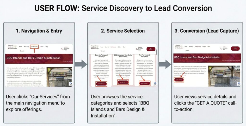
A cleaner, service-first structure that makes key pages easy to find:

  • Services are easier to browse
  • Contact / estimate actions are easier to access
  • Users can move from interest → intent without friction

Conversion flow changes

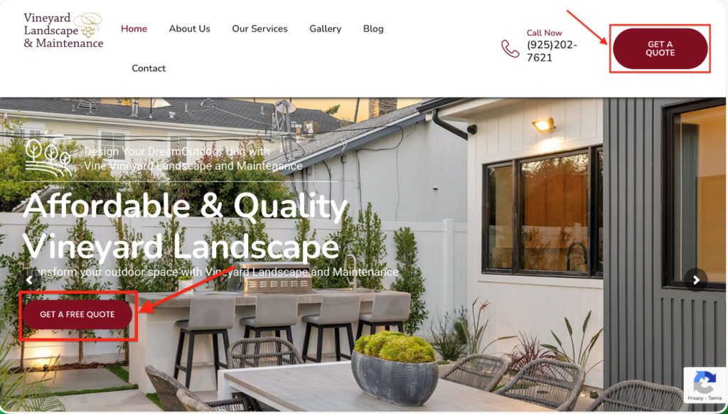
Conversion prompts are intentionally repeated where users decide:

Ready for a website that actually converts?

If your site looks dated, isn’t mobile-first, or visitors keep leaving without contacting you, WSIMLogiX can rebuild it into a conversion-focused, fast, SEO-ready website.

Need help with SEO in San Francisco – Bay Area? Contact our experts today!